Toggle
The following page documents visual specifications such as color, typography, structure, and size.
Color
| Element | Property | Color token |
|---|---|---|
| Label text | text color | $text-secondary |
| Action text | text color | $text-primary |
| Background (off) | background-color | $toggle-off |
| Handle (off) | background-color | $icon-on-color |
| Background (on) | background-color | $support-success |
| Handle (on) | background-color | $icon-on-color |
| Checkmark | fill | $support-success |
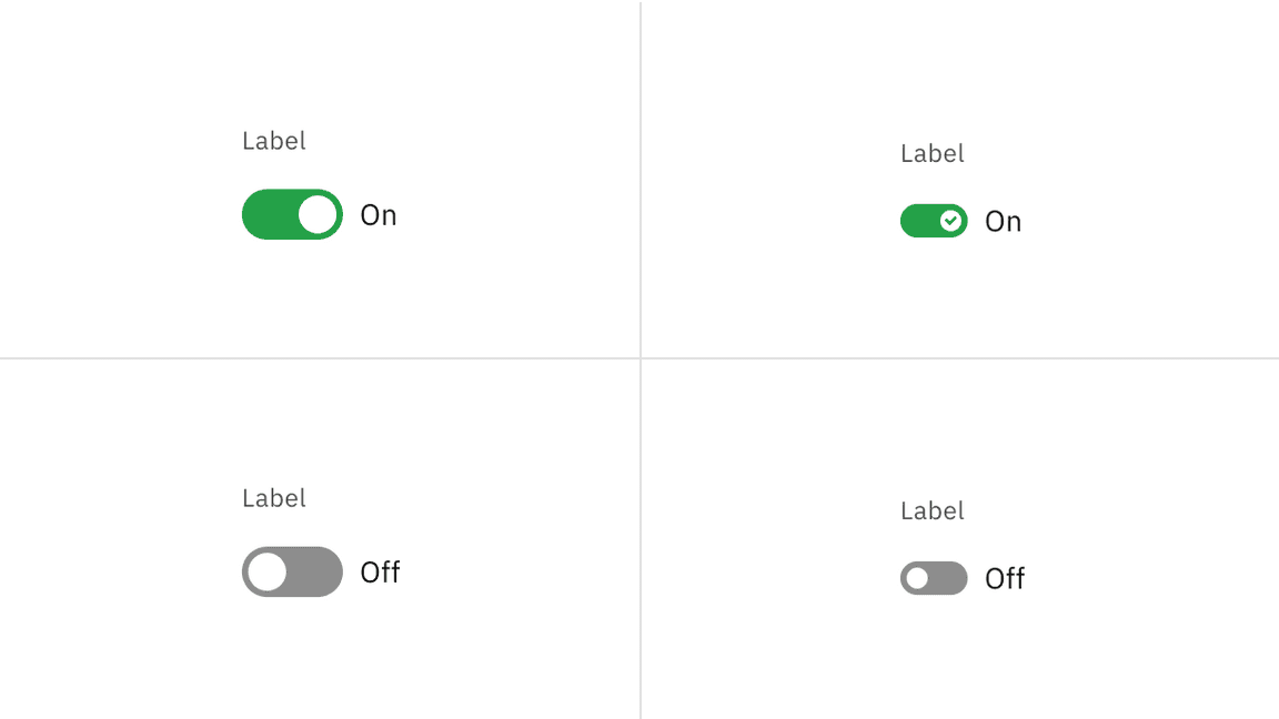
On and off toggle states
Interactive states
The default and small toggle can be switched on and off across focus, disabled, and read-only states.
| State | Element | Property | Color token |
|---|---|---|---|
| Focus | Toggle | border | $focus |
| Disabled | Label text | text color | $text-disabled |
| Action text | text color | $text-disabled | |
| Background | background-color | $button-disabled | |
| Handle | background-color | $icon-on-color-disabled | |
| Checkmark | inner fill | button-disabled | |
| Read-only | Label text | text color | $text-secondary |
| Action text | text color | $text-primary | |
| Background | background-color | transparent | |
| Border | border | border-subtle * | |
| Handle | background-color | $icon-primary |
* Denotes a contextual color token that will change values based on the layer it is placed on.
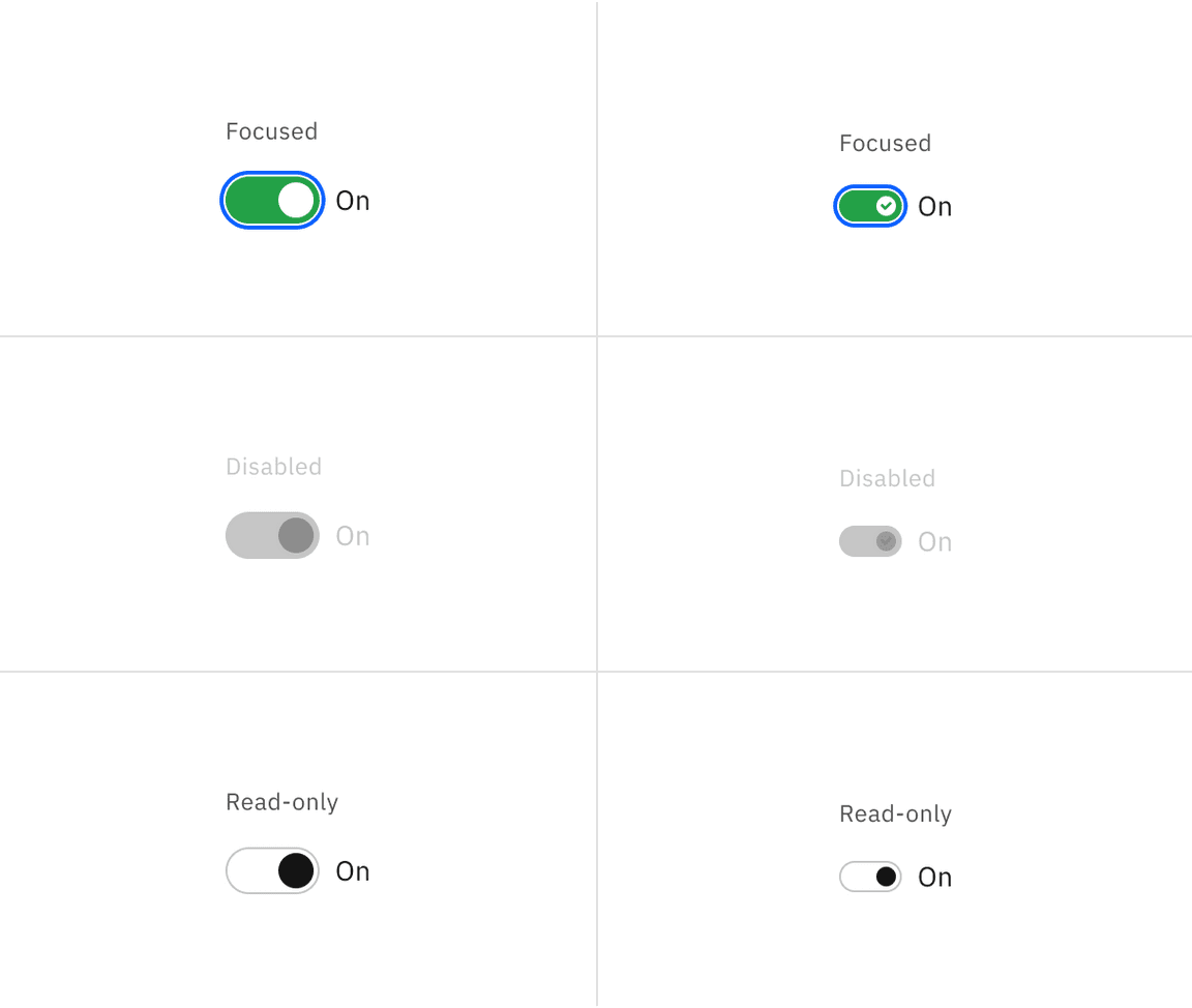
Interactive toggle states.
Typography
Toggle labels should be set in sentence case, with only the first word in a phrase and any proper nouns capitalized, and no more than three words.
| Element | Font-size (px/rem) | Font-weight | Type token |
|---|---|---|---|
| Label text | 12 / 0.75 | Regular / 400 | $label-01 |
| Action text | 14 / 0.875 | Regular / 400 | $body-compact-01 |
Structure
Default toggle
| Element | Property | px / rem | Spacing token |
|---|---|---|---|
| Toggle | width | 48 / 3 | – |
| height | 24 / 1.5 | – | |
| Handle | height, width | 18 / 1.25 | – |
| Label text | margin-top, margin-bottom | 16 / 1 | $spacing-05 |
| Action text | margin-left | 8 / 0.5 | $spacing-03 |
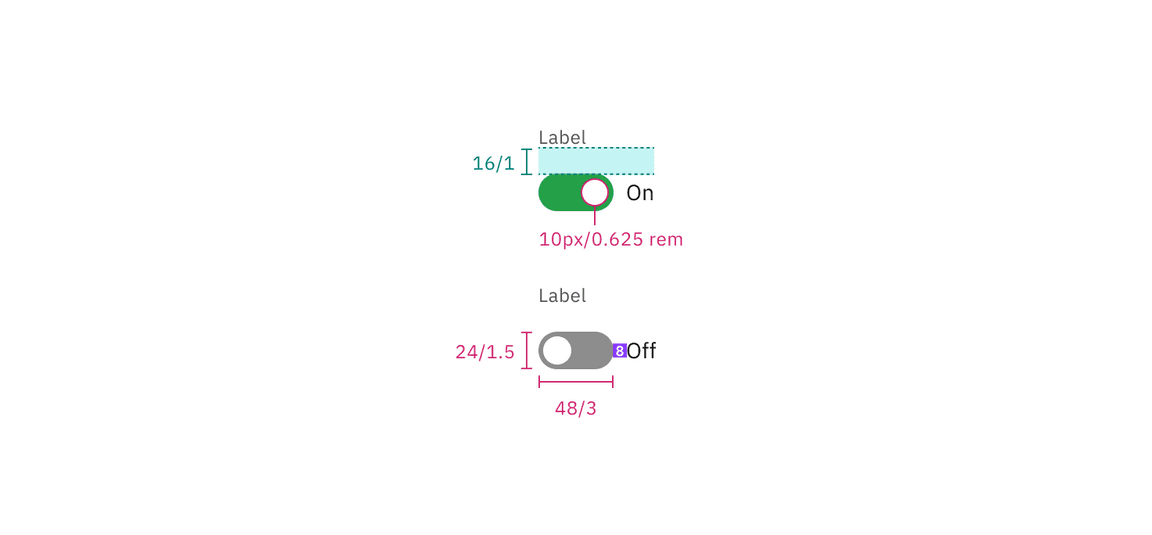
Structure and spacing measurements for default toggle | px / rem
Small toggle
| Element | Property | px / rem | Spacing token |
|---|---|---|---|
| Toggle | width | 32 / 2 | – |
| height | 16 / 1 | – | |
| Handle | height, width | 10 / 0.625 | $spacing-03 |
| Action text | margin left | 8 / 0.5 | $spacing-03 |
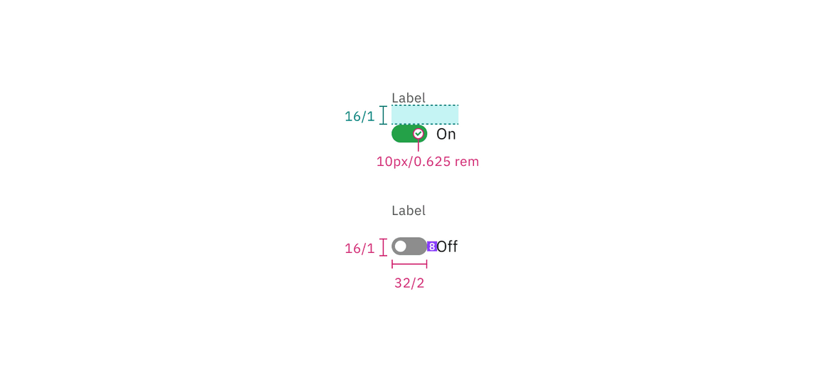
Structure and spacing measurements for small toggle | px / rem
Size
| Size | Height px / rem |
|---|---|
| Small (sm) | 16 / 1 |
| Default | 24 / 1.5 |
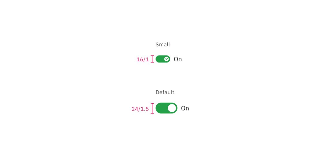
Toggle sizes | px / rem
Feedback
Help us improve this component by providing feedback, asking questions, and leaving any other comments on GitHub.